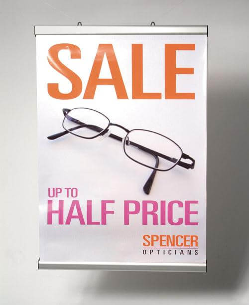
Posters are a great way to promote events, products, or services, but creating a poster that stands out can be a challenge. This guide to poster printing offers tips and tricks to help you create eye-catching designs that grab attention and effectively convey your message. Whether you're printing posters for a business, event, or personal project, this guide has everything you need to know to create high-quality prints.
Choose the right size and paper type.
Before you start designing your poster, it's important to choose the right size and paper type. The size of your poster will depend on where it will be displayed and how much information you need to include. Common sizes include 11x17 inches, 18x24 inches, and 24x36 inches. When it comes to paper type, consider factors such as durability, finish, and weight. Glossy paper can make colors pop, while matte paper can give a more professional look. Thicker paper can also add durability and prevent tearing.
Use high-quality images and graphics.
One of the most important aspects of creating an eye-catching poster is using high-quality images and graphics. Low-resolution images or graphics can appear blurry or pixelated when printed, which can detract from the overall impact of your poster. Make sure to use high-resolution images and graphics, and consider using vector graphics for logos or other elements that need to be scaled up or down without losing quality. You can also use stock images or graphics to add visual interest to your poster, but make sure to choose ones that are relevant to your message and don't appear too generic.
Keep your message clear and concise.
When designing a poster, it's important to remember that you only have a few seconds to grab someone's attention and convey your message. Keep your message clear and concise, using short sentences and bullet points to break up text. Use bold or larger font sizes for important information, and make sure your message is easy to read from a distance. Avoid cluttering your poster with too much information or too many graphics, as this can make it difficult for viewers to focus on your main message.
Use contrasting colors to make your design pop.
One of the most effective ways to make your poster stand out is to use contrasting colors. This means using colors that are opposite each other on the color wheel, such as blue and orange or red and green. Contrasting colors create visual interest and make your design more eye-catching. However, be careful not to use too many contrasting colors, as this can make your poster look chaotic and overwhelming. Stick to two or three contrasting colors at most, and use them strategically to draw attention to important information or elements of your design.

